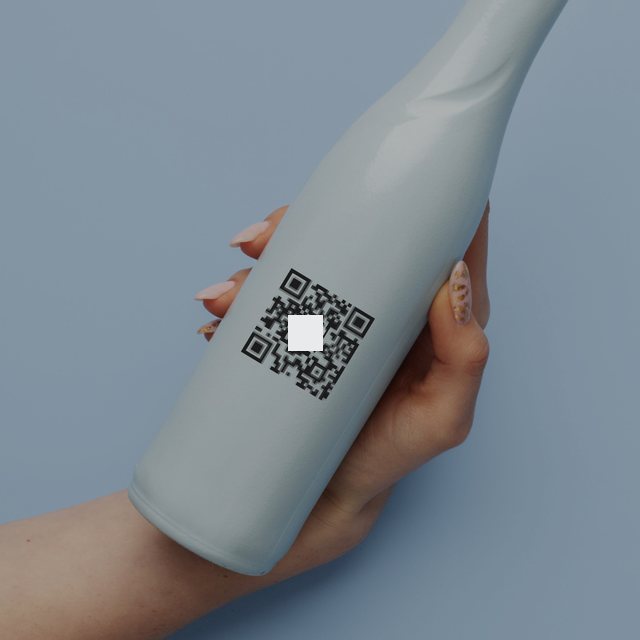
A QR-based product authentication experience designed to help consumers identify suspicious products, verify authorized product identifiers, and make more confident purchasing decisions.
I’m Sanand — a UI/UX designer from Kerala who turns complex problems into products that feel effortless. I care about clarity over decoration, honesty over hype, and design decisions you can measure.
01
Clarity first
The interface should never compete with the information it is trying to communicate.
02
Honest by design
Transparent states and clear limitations build more trust than any visual flourish.
03
Measured decisions
Every decision comes with a reason, a user benefit and a way to measure whether it worked.
What if you could know a product is genuine before you trust it?
A smarter way to verify. A simpler way to trust. A QR-based product authentication experience designed to help consumers identify suspicious products, verify authorized product identifiers, and make more confident purchasing decisions.
UX/UI Design
UX Research
Product Strategy
B2C
Application
Project
VERIQ — Product Authentication App
Role
UX Research · Product Strategy · UX/UI Design · Prototyping
Type
Independent Concept Project
Platform
iOS & Android
Focus
QR-based product verification
How do you want to read it?
— minEvery chapter, every decision and the reasoning behind it.
(Overview)
The project in a minute
The problem
Counterfeits are getting harder to spot.
Counterfeit products are becoming increasingly difficult to distinguish from genuine ones. Packaging can look convincing, product information can be misleading, and consumers often have no simple way to establish whether a product can be trusted.
The idea
What if verifying a product was as simple as scanning a QR code?
VERIQ brings product verification into one straightforward experience. Scan a code, understand the result, explore product details, and report suspicious activity.
What I designed
A consumer-focused product authentication experience.
QR scanning verification.
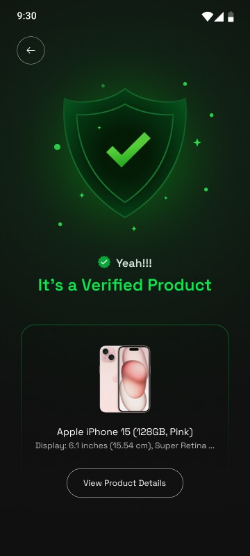
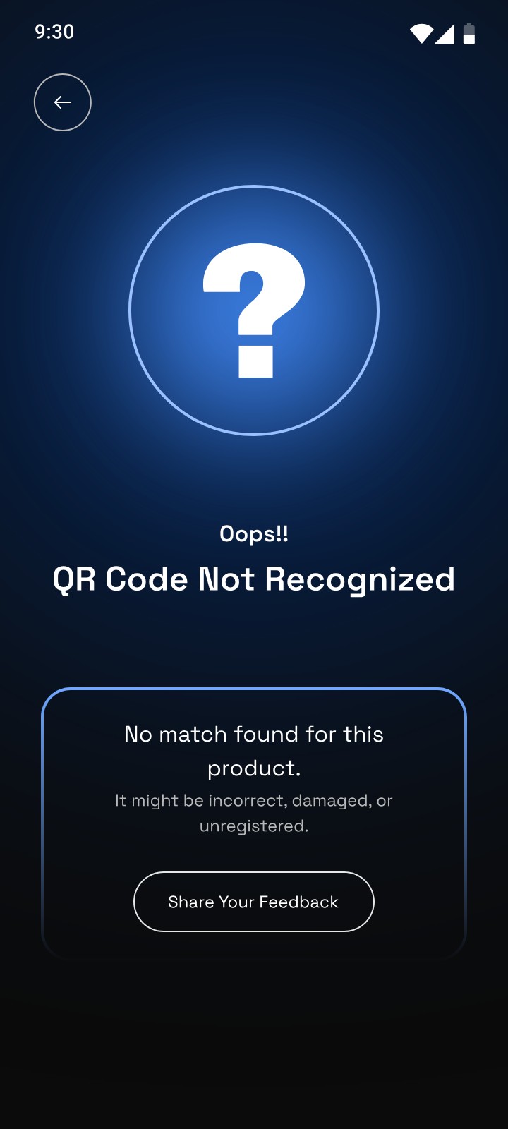
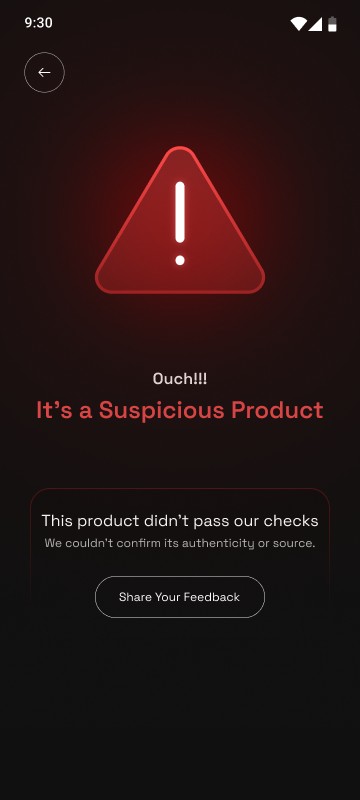
Three distinct verification result states.
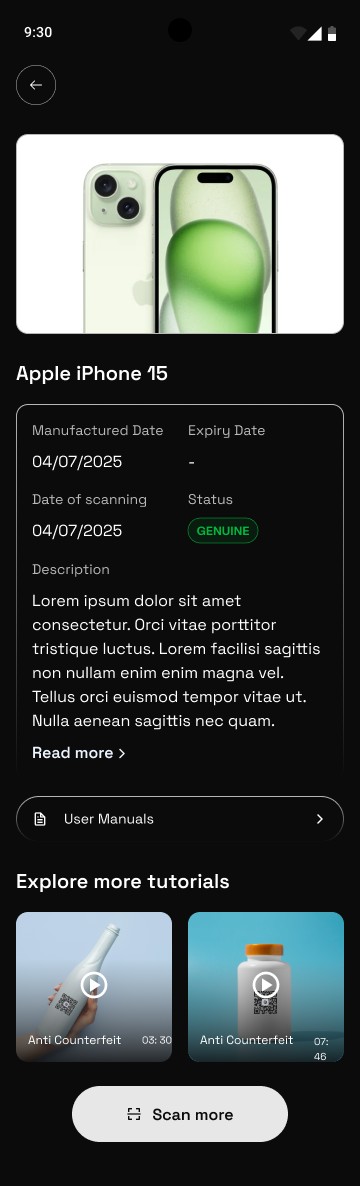
Product information and verification history.
A counterfeit reporting experience.
A simple, trust-focused design system.
The design challenge
How do you communicate something as complex as product authentication through an experience that feels effortless?
01The Origin
Trust should never be a guessing game.
Consumers are expected to identify counterfeit products without access to reliable verification tools. So I started with one question:
Imagine buying an expensive pair of headphones. The packaging looks authentic. The branding is familiar. Everything appears legitimate.
But something feels off.
You search online, compare product images, inspect the packaging, and look for reviews. Yet none of these things can confidently tell you whether the product is genuine.
And that is the problem. Consumers are expected to identify counterfeit products without having access to reliable verification tools. The more convincing counterfeit products become, the harder it is for ordinary consumers to distinguish them from genuine ones.
I started exploring a simple question:
Why should verifying a product be harder than buying one?
That question became the starting point for VERIQ.
02The Insight
The problem isn’t scanning. It’s knowing what to trust.
Having a code isn’t the same as verifying a product. A meaningful check needs a trusted source, a reliable process and an understandable result. Three gaps stood out:
QR codes, barcodes, and serial numbers already exist on countless products. But simply having a code doesn’t mean consumers know how to verify it.
There is a difference between scanning a code and actually verifying a product. A QR code can direct someone to a website. A serial number can identify a product. But a meaningful authentication experience needs a trusted source, a reliable verification process, and an understandable result.
I identified three important experience gaps to investigate:
01
Accessibility
Consumers need a verification process that doesn’t require technical knowledge or complicated steps.
02
Clarity
A successful scan should communicate what was verified, what evidence supports the result, and what it means.
03
Confidence
Users need guidance when something looks suspicious or when the system cannot establish authenticity.
The central insight
A successful authentication experience isn’t about showing a green tick. It’s about helping people make a confident decision.
03The Goals
What VERIQ had to feel like, not just do.
I wanted VERIQ to feel like a trustworthy product rather than another complicated security application.
User goals
Verify products quickly and conveniently.
Understand whether an identifier is recognized by an authorized brand.
Identify suspicious verification activity.
Access reliable product information.
Report concerns without unnecessary steps.
Feel informed rather than overwhelmed.
Design goals
Make scanning the primary interaction.
Keep the interface minimal and intuitive.
Communicate verification results through clear visual hierarchy.
Differentiate suspicious and unrecognized QR results.
Build trust through transparency rather than visual decoration.
Create an experience that can scale across product categories and brands.
The design principleSimple to scan.Clear to understand.Honest about trust.
04Six Design Decisions
Six decisions that shaped the VERIQ experience.
Every design decision was made around one question: How can I make product verification feel effortless while maintaining the credibility of the result?
123
01Decision
Verification comes first.
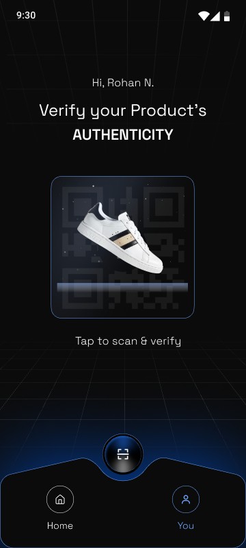
The home screen gives scanning the strongest visual priority — people open VERIQ to verify a product, so that is where they start.
Most applications introduce users to multiple features, menus, and options. VERIQ starts with the one thing users came to do: verify a product.
1A single, clear promise: verify your product’s authenticity.
2The scan card is the hero — nothing on the screen competes with it.
3A persistent scan button, always one tap away.
Why
Users shouldn’t have to search through an application to find its most important feature.
For the user
Less navigation. Fewer decisions. Faster access to verification.
For the experience
A clear entry point reduces cognitive load and makes the app immediately understandable.
How I’d measure itTime taken to start verification% who find the scan action unassistedHome-screen task completion rate
123
02Decision
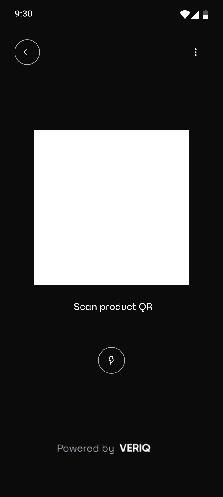
Scanning should feel effortless.
A clearly defined scanning frame and simple positioning instructions guide even first-time users through the scan.
Scanning is the central interaction, so it needs to be intuitive even for someone using the app for the first time.
Instead of presenting a complicated camera interface, the scanner focuses on a clearly defined scanning frame and simple positioning instructions. The experience should guide users through the process rather than expecting them to figure it out.
1A clearly defined scanning frame.
2One simple positioning instruction.
3Flash control for poor lighting, without leaving the scan.
Why
Scanning conditions are not always ideal. Product packaging can be reflective, labels can be damaged, and lighting can be poor.
For the user
The experience feels guided rather than technical.
How I’d measure itSuccessful scan rateTime to capture an identifierNumber of retries
Genuine
Suspicious
QR Not Recognized
03Decision
Three outcomes. No confusion.
Genuine, Suspicious and QR Not Recognized — because an unknown identifier is not necessarily a counterfeit.
This was one of the most important decisions in the project. A verification system cannot treat every result as either genuine or fake.
An unknown identifier is not necessarily counterfeit. A network error does not indicate fraud. A duplicated identifier requires context. I designed three distinct outcome states.
Genuine
The identifier matches an authorized issuer record and has passed the checks shown in the result. The user can review the product information and verification evidence.
Suspicious
The system identifies a specific security concern, such as a revoked identifier or suspicious reuse. The user receives an explanation and guidance on what to do next.
QR Not Recognized
The system cannot establish a result because the identifier is unsupported, information is unavailable, or a technical issue prevents verification. The user can retry or contact the brand.
Why
Users need accurate information, not an oversimplified green-or-red answer.
For the user
They understand the result and know what action to take.
For the experience
Clear status communication prevents false reassurance and unnecessary alarm.
How I’d measure itResult comprehensionIncorrect interpretation rateConfidence in the next action
1234
04Decision
Trust needs evidence, not just a green tick.
Results explain what was checked — the product, its issuer, identifier status and timestamps — instead of asking users to trust an icon.
A green check mark can communicate success, but it cannot explain why something should be trusted. I wanted the verification result to provide more context.
1Manufactured date and verification timestamp.
2Identifier status, clearly labelled.
3Brand-provided manuals and documentation.
4A quick way on to the next scan.
The product information screen includes
Product name and image
Brand or authorized issuer
Unique product identifier
Verification timestamp
Identifier status
Available verification evidence
Important limitations of the check
Why
Trust should be supported by transparent information.
For the user
They can understand what the system checked rather than simply accepting a visual indicator.
For the experience
The result becomes informative, credible, and actionable.
How I’d measure itProduct-detail engagementResult comprehensionConfidence after reviewing evidence
1234
05Decision
Reporting shouldn’t feel like another problem.
A suspicious result leads straight into a short, structured report — pre-filled where possible — instead of ending at a warning.
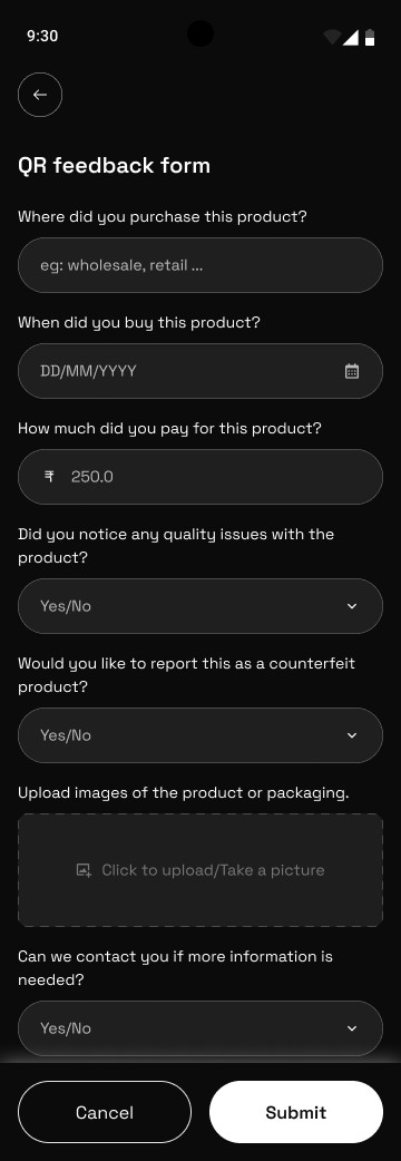
What happens when someone discovers a suspicious product? The experience shouldn’t end with a warning message.
I introduced a reporting flow that allows users to submit a concern with relevant information. Where information is already available from the scan, it should be automatically populated.
1Plain-language questions, one per field.
2The right input for each answer — dates, amounts, yes/no.
3Optional photos of the product or packaging.
4One clear primary action to submit.
Why
Reporting should require as little additional effort as possible.
For the user
They have a way to take action instead of being left with uncertainty.
For the experience
The app creates a channel for structured reports that participating brands can investigate.
How I’d measure itReporting completion rateForm abandonmentTime to submit a reportReport evidence completeness
06Decision
The scanner should talk back.
Seven live scanning conditions tell users exactly what is happening — and what to adjust — before frustration sets in.
Most failed scans aren’t caused by the code — they’re caused by the conditions around it. A silent camera leaves people guessing why nothing is happening.
So the QR scan screen reacts in real time, with seven conditions shown right below the scanning frame. Tap any of them to see the actual screen.
Ready to scanDistanceLighting
Why
Glare, distance, low light and shaky hands are the everyday reasons scans fail — and none of them are obvious to the user.
For the user
Clear, real-time guidance instead of guessing why the scan isn’t working.
For the experience
Fewer failed attempts, less frustration, and a scanner that feels helpful rather than technical.
How I’d measure itFirst-attempt scan successTime to a successful scanRetries per scan sessionDrop-off on the scanner
05The Screens
From scanning a product to understanding its authenticity.
The screens bring the design decisions together into one continuous experience — shown here as the four journeys a user moves through.
Journey 01 — 3 screens
Get started
A calm introduction, a home screen that puts scanning first, and a camera that guides instead of waiting.
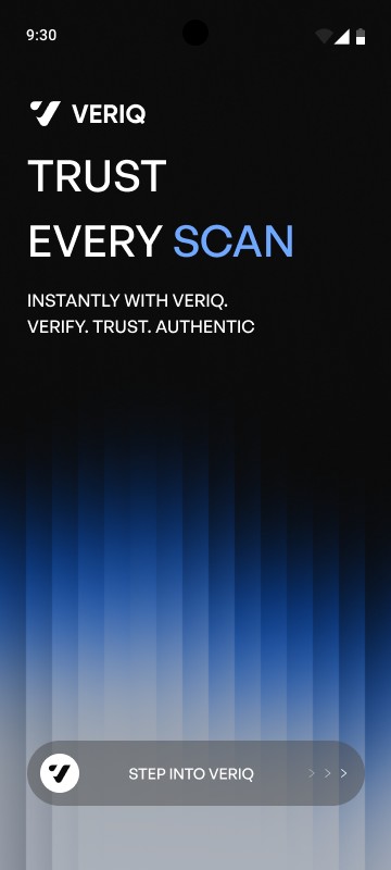
01WelcomeAn introduction to VERIQ and its purpose.
02HomeA simple dashboard that puts product verification first.
03ScannerA focused camera interface with clear scanning guidance.
Welcome
Home
Scanner
Journey 02 — 3 screens
The verdict
Three results that are impossible to misread — each with a clear next step.
04GenuineA positive result with product information and verification evidence.
05SuspiciousA security warning with an explanation and recommended action.
06QR Not RecognizedA transparent message when the system cannot recognise the code.
Genuine
Suspicious
QR Not Recognized
Journey 03 — 3 screens
Go deeper
Evidence behind a genuine result, and a short report when something looks wrong.
07Product detailsA detailed view of the product and its verification record.
08Report productA structured reporting experience for suspicious products.
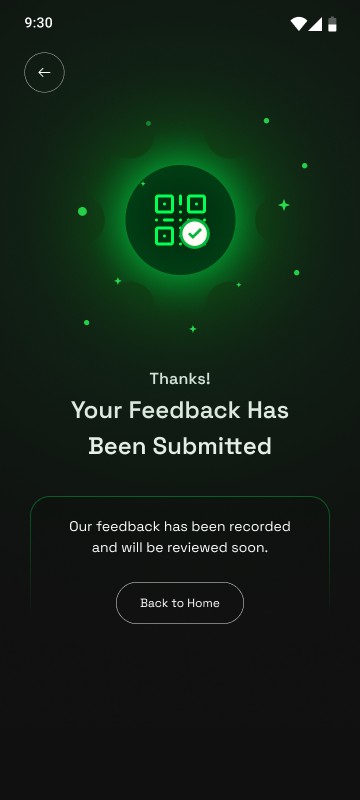
09Report submittedConfirmation that the report has been received.
Product details
Report product
Report submitted
Journey 04 — 2 screens
Keep track
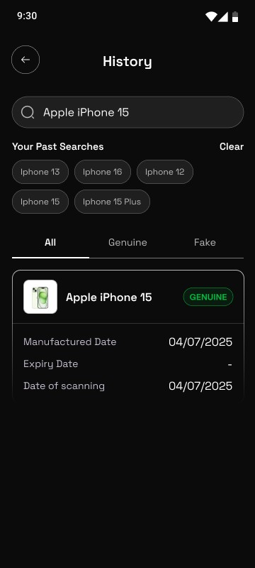
Every check is saved and searchable, and can be filtered by genuine or fake results.
10Scan historyA record of previous product checks.
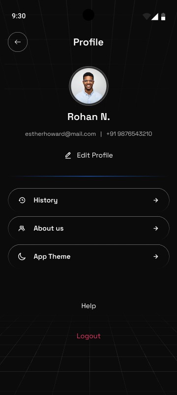
11ProfileAccount details with quick access to history and app settings.
Scan history
Profile
01 / 04
06The Visual Language
Security doesn’t have to look complicated.
I wanted the interface to feel modern, minimal, and approachable. Rather than relying on conventional security aesthetics, the visual direction focuses on clarity, typography, spacing, and meaningful status indicators.
Modern, minimal and approachable — clarity, typography, spacing and meaningful status colours instead of conventional security aesthetics.
Primary identity
Obsidian Black #0B0B0B
Genuine
Green #04FF54
Suspicious
Red #EA4D4D
QR Not Recognized
Blue #2B61B4
Scan guidance
Amber #FFA000
Aa
Typeface
Space Grotesk
Regular 400Medium 500SemiBold 600
It’s a Verified ProductThis product didn’t pass our checks · Hold still to scan
Colour
Obsidian Black establishes the primary identity. Green communicates a genuine result, red a suspicious one and blue a QR code that isn’t recognized, while amber guides the scan.
Typography
Space Grotesk creates a readable hierarchy and keeps information easy to scan.
Components
Consistent buttons, cards, status indicators, and input fields create a predictable experience across the application.
Interaction
Subtle feedback, clear loading states, and purposeful transitions help users understand what is happening.
Design philosophy
The interface should never compete with the information it is trying to communicate.
07Designed vs. Built
An honest look at the product.
VERIQ is presented as a design concept. Its proposed experience and its technical implementation should be distinguished clearly.
VERIQ is a design concept: the full consumer journey is designed and prototyped, while the verification infrastructure behind it still needs to be built.
Designed Concept
Complete consumer verification journey.
Onboarding and home experience.
QR scanning interface.
Manual identifier entry.
Verification result states.
Product details.
Verification history.
Counterfeit reporting.
Design system and reusable components.
Interactive prototype.
Requires implementation Next
Secure QR identifier generation.
Brand onboarding and issuer management.
Product verification database.
Server-side authentication.
Duplicate and suspicious scan detection.
Product registry integration.
Report management dashboard.
Production analytics and security monitoring.
The important distinction
Designing a verification experience and building a reliable authentication system are two different challenges. The interface can communicate a result, but the credibility of that result depends on the infrastructure behind it.
08What VERIQ Could Become
The idea is bigger than a QR scanner.
The initial experience focuses on consumers, but the platform has opportunities beyond individual product verification.
01
Brand dashboard
A dedicated platform where brands can register products, manage identifiers, and review suspicious activity.
02
Product journey
Allow consumers to understand relevant product information and available supply-chain history.
03
Retailer verification
Help retailers verify products and report suspicious inventory before it reaches consumers.
04
Smart risk detection
Identify suspicious patterns through contextual scan history and other reliable signals.
05
Multi-category expansion
Extend the verification experience to electronics, cosmetics, fashion, packaged goods, and other participating product categories.
The long-term vision
VERIQ could become more than an application for checking products. It could become a connected layer of trust between brands, retailers, and consumers.
09Reflection
Trust is not something you can design with a check mark.
Working on VERIQ highlights an important distinction between designing an attractive interface and solving a meaningful user problem.
The initial challenge appears simple: scan a QR code and tell someone whether a product is genuine. But the deeper challenge is much more complex.
01What happens when a code is copied?
02What if the database doesn’t recognize a product?
03What if the system is unavailable?
04How do you prevent users from confusing an unknown result with a counterfeit warning?
The lesson: good UX is not just about making interactions faster. It is about making information understandable, decisions easier, and limitations transparent.
These questions shaped the direction of the experience.
The biggest lesson from this project is that good UX is not just about making interactions faster. It is about making information understandable, decisions easier, and limitations transparent.
If I were to take VERIQ further, I would prioritize validating the result experience with real users and working with an authorized brand to test the verification infrastructure.
Because ultimately
People don’t just want to scan a product. They want to know they can trust what they’re buying.
VERIQ. Scan less uncertainty. Trust with confidence.

 Read case study